.svg)


Most advice on B2B website design is written for the small minority of visitors who are ready to buy today, and much of it rests on statistics that fall apart when you check the source. This guide separates what the research supports from what the industry repeats, and shows how the difference changes the brief you write for a new website.
Quick answer: what makes a B2B website work
Good B2B website design does two jobs that pull against each other. The website has to convert the small share of visitors who are evaluating right now, and it has to be memorable and legible to the much larger share of potential customers who will only start evaluating in six months or two years. Most web design projects are scoped for the first job and quietly fail the second.
- Clarity beats persuasion. Buyers need to know what you sell, who it is for, and what happens next.
- Show the price, or an anchor. Pricing opacity is the most consistent complaint in B2B buyer research.
- Design for a committee, not a persona. Forrester puts the average buying group at 13 people internally.
- Answer speed matters more than form length. Response time inside five minutes changes outcomes far more than removing a field.
- Most published conversion tips are untested at B2B traffic volumes. Very few B2B pages carry enough traffic to run a valid A/B test.
What is a B2B website?
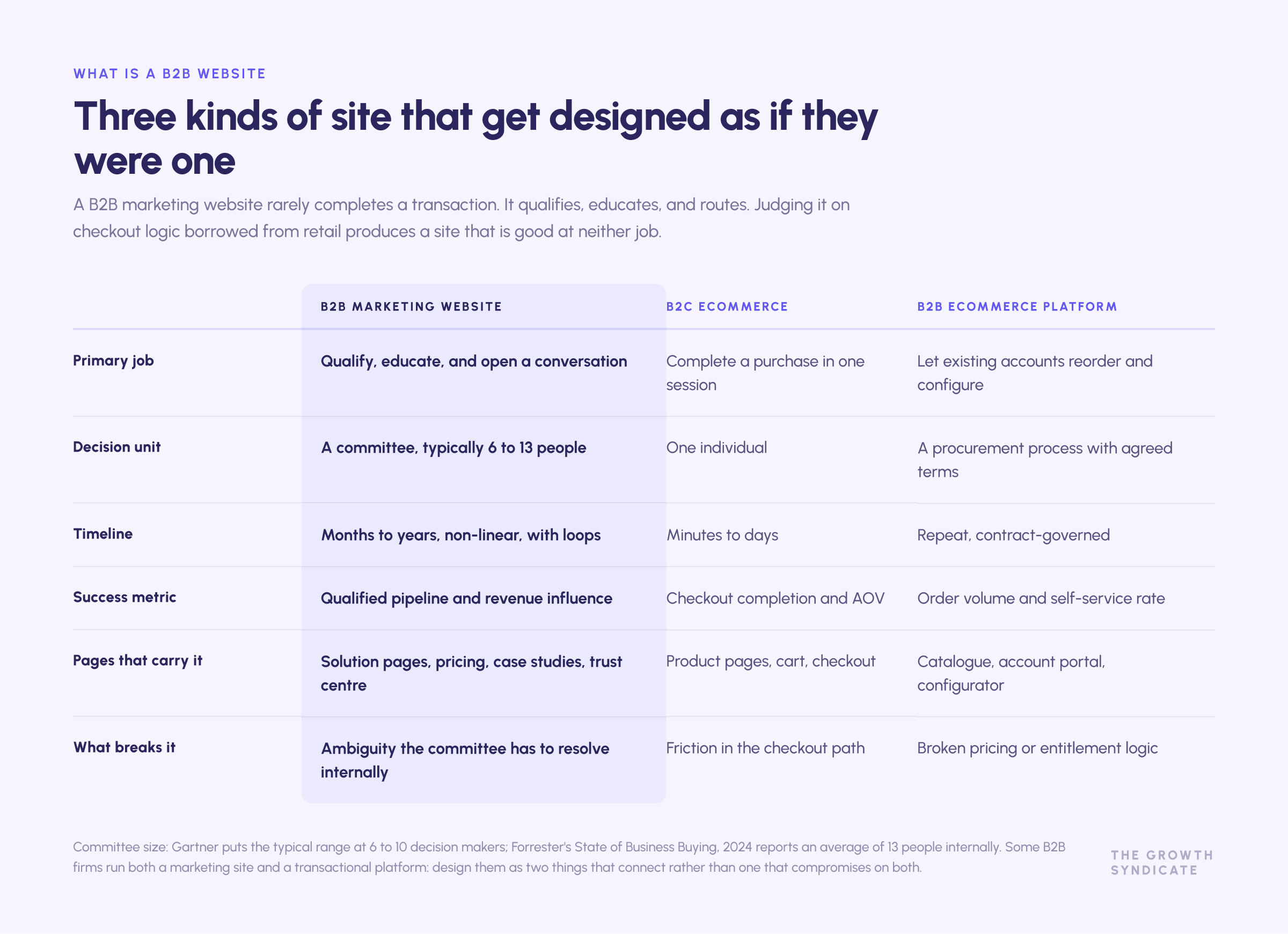
A B2B website is the site a company that sells to other businesses uses to explain what it does, prove it can do it, and open a commercial conversation. In business to business markets the site rarely completes a transaction. It qualifies, educates, and routes.
That is the practical split from a consumer ecommerce platform. A retail site is measured on checkout completion. A B2B website is measured on whether the right traffic arrives, understands the offer, finds the evidence it needs, and reaches one of a handful of conversion points that a sales team can act on. The full range of what it holds is wider than a shop: product and solution pages, the services offered and who they are for, case studies, documentation, security information, pricing, careers, and a library of resources that keeps working for months after a visitor first lands.
Some B2B firms do run a genuine ecommerce platform, particularly distributors and manufacturers with catalogue products. Even there, the marketing site and the transactional platform serve different jobs and should be designed as two things that connect, not one thing that compromises on both.
It is worth being precise about what the site is for, because "lead generation" is doing a lot of unexamined work in most briefs. A B2B website generates leads, but it also does three other things that never appear in a conversion report: it forms first impressions with people who will not buy for two years, it arms an internal champion with material to persuade colleagues, and it answers questions that would otherwise consume sales time. Judge the design against all four jobs, not only the one that shows up in the dashboard.
The design problem nobody puts in the brief
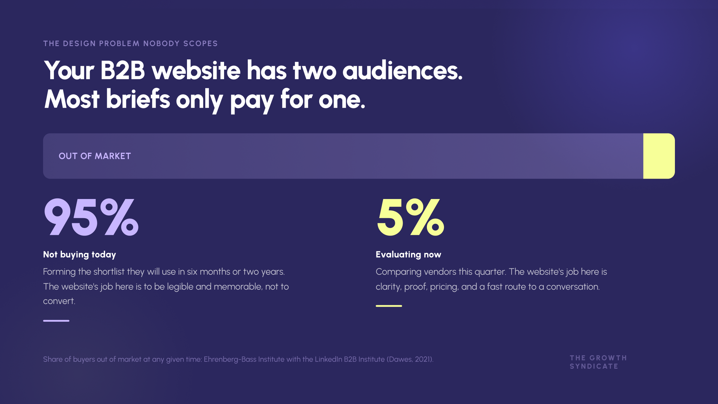
Almost every B2B web design brief is written as a conversion brief. Increase demo requests. Reduce bounce rate. Improve the funnel. Those are reasonable business goals, and they describe roughly one twentieth of the people who will visit the site.
The 95% you are not designing for
Work published by the Ehrenberg-Bass Institute with the LinkedIn B2B Institute put the share of business buyers who are out of market at any given moment at around 95%. The logic is category purchase cadence: companies replace a CRM every few years, change banks less often than that, and re-tender an ERP almost never. Only a thin slice of your addressable market is shopping this quarter.
Our own view of this at The Growth Syndicate is more or less identical, and it comes from watching where clients waste money. In any market, 90 to 95% of your potential clients are not currently looking for a solution. Most marketing spend still chases the 4 or 5% who are, through paid search, outbound, and retargeting. Meanwhile the far larger group is forming the shortlist it will use later, and forming it without you.
The CRM example makes it concrete. A company that does not need a CRM today is not searching for one. The moment it does, three names are already in the room. Nobody runs a neutral evaluation from a blank page. Those three companies earned their place through years of visibility, content, and reputation, not through a landing page test.
What this changes about the brief
If your B2B website design only optimises for conversion, the site is invisible to the group that decides your next two years of pipeline. If it only builds brand, the buyers who are ready today leave without a way to talk to you. A B2B website has to be conversion focused at its key pages and memorable everywhere else.
That has design consequences. Distinctive visual identity is not decoration in this framing, it is what makes the website retrievable from memory later. A website that could be any of nine competitors has failed the 95% even if it converts the 5% adequately.
.avif)
"Marketing is very scattered. The marketing team does a lot of things but they don't connect... It's all very much the activity and not the outcome. Which means that marketing creates very scattered, a lot of top funnel noise, but it's not driving revenue."
The same failure shows up in web design. A website gets rebuilt because it looks dated, ships with more pages and better animations, and moves no business metric, because nobody asked which of the two jobs it was failing at.
Who is actually on the other side of the screen
The buying committee has outgrown your persona doc
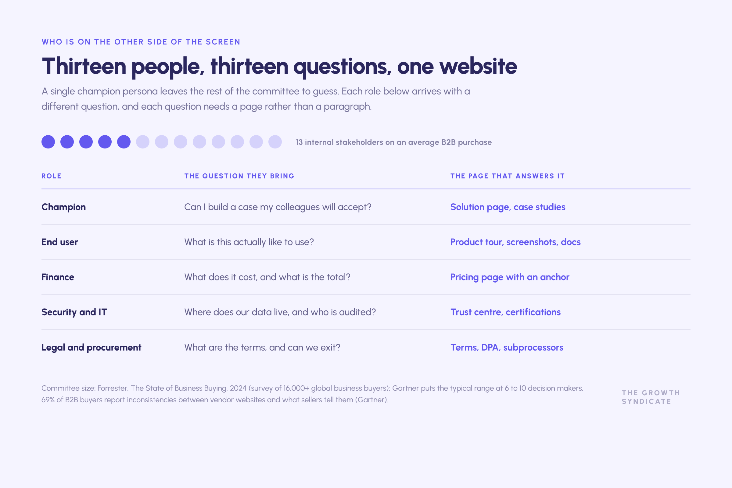
Gartner's long-standing figure for a complex B2B purchase is six to ten decision makers, each arriving with four or five independently gathered pieces of information. Forrester's State of Business Buying, 2024, based on a survey of more than 16,000 business buyers, put it higher: on average 13 people inside the organisation are involved in the buying decision, and 89% of purchases cross multiple departments.
In practice that means legal, procurement, security, finance, and the end users all arrive with different questions, and the people you talk to are frequently not the people who will use the product. A website built around one champion persona leaves the other twelve to guess.
The consequence for information architecture is direct. Solution pages organised only by product feature serve the evaluator and nobody else. The CFO wants commercial terms and total cost. The security lead wants certifications and data residency. The end user wants to see the interface. Each of those is a page, or at minimum a clearly signposted section, rather than a paragraph buried in a services offered list. End users in particular are badly served: they want to see the interface, and a features table is not an example of the product.
Buyers do most of the work without you
Gartner's research puts the share of total purchase time B2B buyers spend with any supplier at roughly 17%, and when comparing several vendors, 5 to 6% with any one sales rep. A Gartner survey of 646 buyers fielded in late 2025 found 67% prefer a rep-free experience, and 45% had used AI during a recent purchase.
Your website is not a support asset for the sales conversation. For most of the buyer's journey, across sales cycles measured in quarters, it is the only asset.
The consistency problem
Gartner also reports that 69% of B2B buyers find inconsistencies between what a vendor's website says and what its sellers tell them. That is a sales and marketing alignment failure showing up as a design problem, and it carries a direct commercial cost. If the site claims one implementation timeline and sales quotes another, the buyer downgrades trust in both.
Related: 77% of B2B buyers describe their most recent purchase as very complex or difficult (Gartner). Complexity is the enemy your site is fighting. Every ambiguity you leave on the page becomes work the committee has to do internally, and 86% of B2B purchases stall somewhere in that process, according to Forrester's 2024 study.
The key pages, and what each one has to do
The homepage: answer "what happens tomorrow if I say yes"
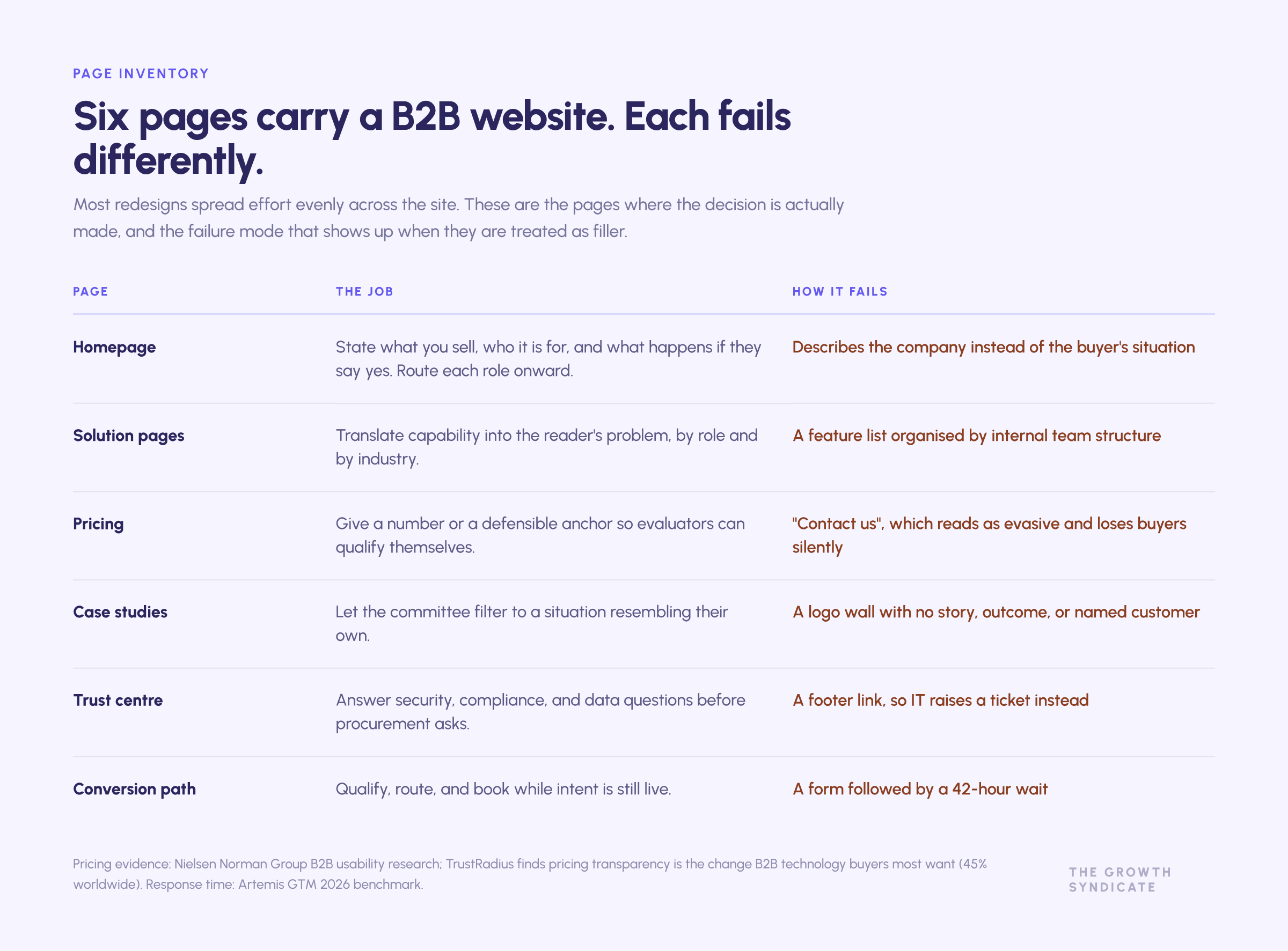
Homepages fail in a predictable way. They describe the company instead of the buyer's situation, they try to serve every segment at once, and they say nothing about what engagement actually looks like.
When Ferdinand rebuilt our own homepage, the organising principle was not a conversion funnel. It was the question every buyer asks silently and almost nobody answers on a website.

In practice that meant replacing team bios with rotating team constellations showing who would actually work on the account, replacing an abstract process diagram with a calendar view of what the first three months contain, and publishing pricing terms plainly. Removing ambiguity is itself a differentiator in a category built on it.
Two practical notes. First, the homepage is often not the entry point: buyers arrive on a blog post, a product page, a review site, or an AI answer. Its job is positioning and routing rather than carrying the whole sale. Second, a clear value proposition beats a clever one every time. If a visitor cannot state your value proposition after five seconds, no amount of design craft recovers it. First impressions on a B2B website are made by the words, not the animation.
A worked example: a homepage that performed instead of equipping
Madeinadd is an Italian digital manufacturing platform selling additive manufacturing into traditional industrial companies. Their existing site was an animated one-pager showing the overall process. It looked current and it demonstrated the technology well.
The problem only shows up when you ask what the sales team did next. They relied heavily on their own collateral to educate buyers, because the website performed the process rather than explaining the services offered. A site that impresses and then hands the work back to sales is failing quietly, and no conversion metric will tell you so.
The rebuild changed three things, and each maps to a principle in this guide. Branding was pushed toward the innovative and disruptive end to differentiate from traditional players, which is the memorability job the out-of-market majority needs. The hero animation carried the transition from conceptual design through to a physical end part, which is the "what happens tomorrow if I say yes" question answered in the language a manufacturing buyer actually thinks in. And the wide range of services was made findable through straightforward wayfinding, which is the navigation problem solved rather than deferred.
The programme around it produced 300%+ market growth with a 65% reduction in customer acquisition cost. The website was one part of that alongside positioning, demand capture, and sales alignment, so the honest reading is that the site stopped being a bottleneck rather than that it produced the growth on its own. That distinction matters, and most agency case studies erase it.
Pricing pages
Nielsen Norman Group's B2B usability research, built on user testing across hundreds of business sites, found B2B task success at 58% against 66% for consumer ecommerce, and singled out hidden pricing as one of the two most damaging patterns. NN/g's argument is that missing pricing creates a negative halo: buyers read it as evasive.
Buyer research agrees. TrustRadius found pricing transparency is the single change B2B technology buyers most want, cited by 45% worldwide. G2 found only a small fraction of its software profiles list explicit prices, which is why it built a pricing section in the first place.
A workable rule for most B2B services companies: publish tiers if your motion is self-serve or mid-market, and publish a starting price anchor plus a "custom from here" tier if your enterprise deals are genuinely bespoke. Publishing nothing is a choice that costs you evaluators you never see, and it slows every deal that does convert prospects into conversations.
Proof: case studies, logos, and third-party reviews
Third-party evidence outperforms self-selected praise. G2's buyer research puts peer review site usage among software buyers at 86%. Forrester's work on trusted sources finds independent experts, analysts, and peers command markedly higher trust than vendor salespeople.
What this means for design is specific. Put review-site ratings and quantified proof at the conversion points, next to the CTA, rather than in a testimonial carousel three screens down. Name the client, the role, and the number. Build case studies so the committee can filter by industry and use case, because a manufacturing customer will not extrapolate from a fintech logo.
The failure pattern is a logo wall of clients with no story attached. Twelve recognisable marks prove you have customers. They do not prove you solved a problem resembling the one the reader has. One example with a named customer, a starting position, and an outcome does more work than a wall, and it survives being forwarded to a colleague who never visited your website.
One caution worth knowing: the FTC's rule banning fake and AI-generated reviews took effect in October 2024, with penalties per violation. Fabricated social proof is now a legal exposure, not just a credibility one.
The trust centre
Security, compliance, and data handling belong on a page of their own, not in a footer link. When IT and legal join the committee early, a page listing SOC 2, ISO 27001, GDPR posture, subprocessors, and data residency removes a procurement round trip. For regulated buyers in health tech or financial services, certifications gate the conversation before it starts.
Interactive tools
ROI calculators, configurators, sizing tools, and assessments earn their keep when they answer a question the buyer cannot answer alone. They are expensive to build and easy to build badly. The test is whether the output changes what the buyer does next. If it produces a number they cannot defend internally, it is a lead capture device wearing a costume.
B2B landing pages: what the evidence supports
Message match and attention ratio
The most reliable landing page principle in the literature is also the least glamorous. The page should continue the sentence the ad started, and it should have one job. Unbounce's benchmark data across tens of thousands of pages shows single-CTA pages outperforming multi-CTA pages, and custom-built pages substantially outperforming templates.
The mechanism is not mysterious. Every additional option is a decision the visitor has to make before the one you want.
Forms: fewer fields is a heuristic, not a law
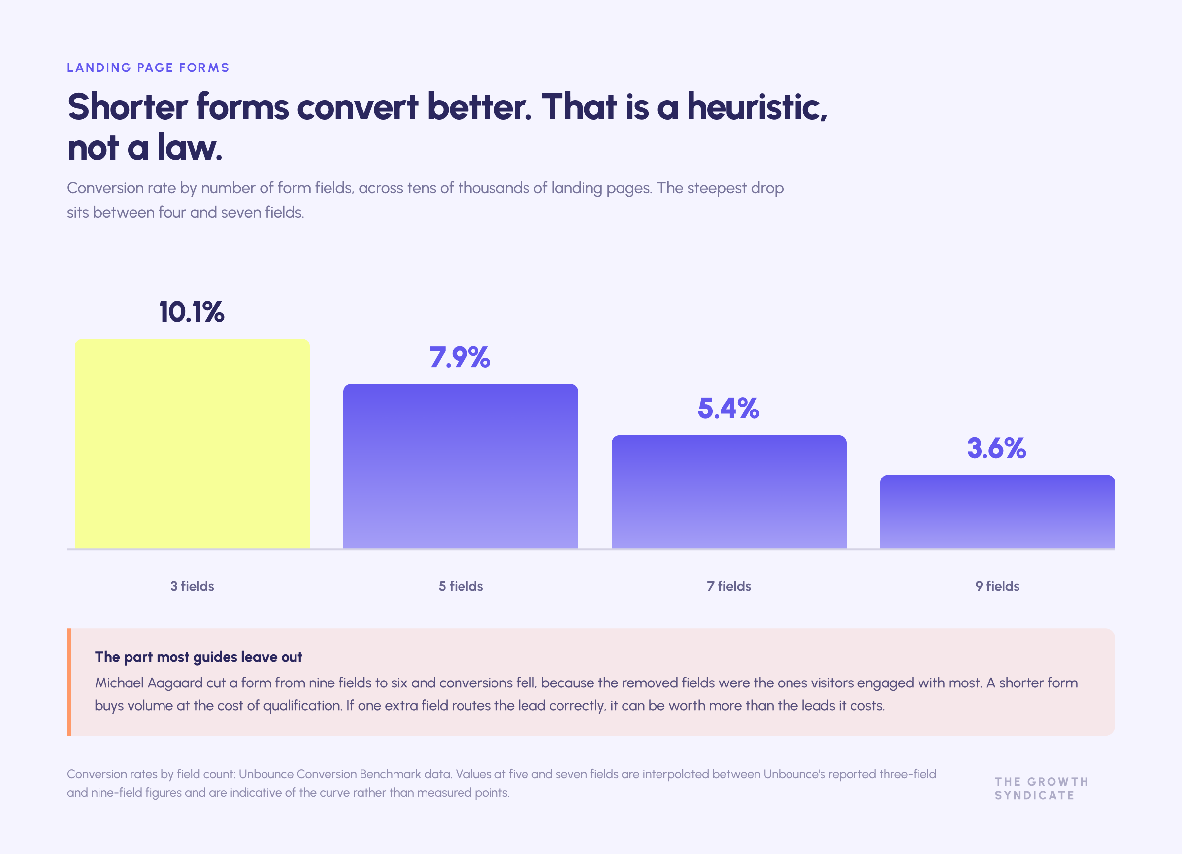
The industry consensus is that shorter forms convert better, and on average that is true. Unbounce data shows three-field forms roughly tripling the conversion rate of nine-field forms, with the steepest drop between four and seven fields.
The nuance is what most guides omit. Michael Aagaard, then at Unbounce, ran the canonical counter-example: cutting a form from nine fields to six reduced conversions, because the fields he removed were the ones visitors were most engaged with. And a shorter form buys volume at the cost of qualification. If an extra field lets you route the lead correctly, its value can exceed the leads it costs you.
LinkedIn Lead Gen Forms show the trade-off at its extreme: conversion rates well above a standard landing page, frequently paired with weaker lead quality and low brand recall.
The honest instruction is to collect the minimum needed to route the lead, then use progressive profiling for everything else, and to judge the change on pipeline rather than on form fills.
Speed to lead beats form optimization
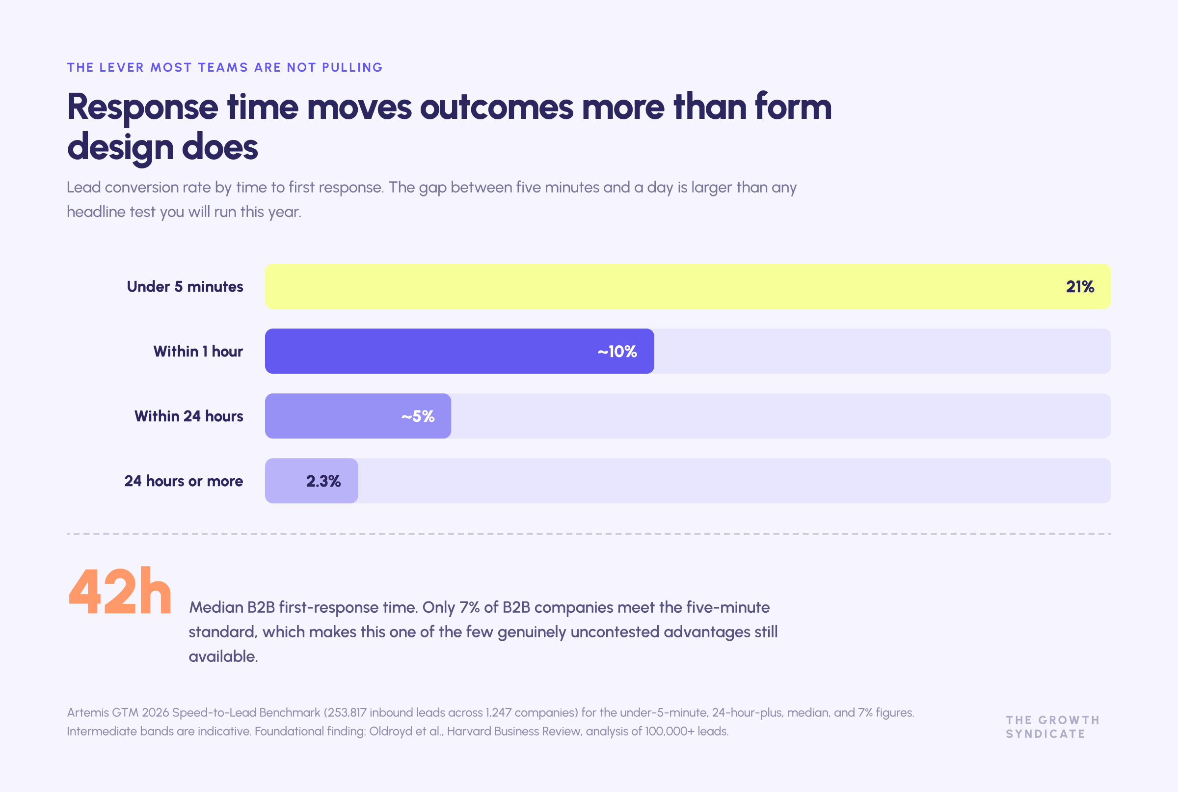
This is the largest lever most B2B marketing teams are not pulling. The foundational study, published in Harvard Business Review from an analysis of more than 100,000 leads, found firms responding within five minutes were 100 times more likely to connect and 21 times more likely to qualify the lead than those waiting 30 minutes.
More recent benchmark data points the same way. Chili Piper's analysis of four million form submissions found instant routing produced a meeting booking rate more than double that of standard follow-up. Artemis GTM's 2026 benchmark, covering 253,817 inbound leads across 1,247 companies, put median B2B first-response time at 42 hours, and found only 7% of B2B companies meet the five-minute standard.
Design implication: replace form-then-wait with qualify-route-book. A calendar that appears immediately after a qualified submission is worth more than any headline test you will run this year.
One caveat worth carrying: work published by Chili Piper with Forrester suggests responses inside 60 seconds can underperform the 90-second to four-minute window, because instant auto-dial reads as surveillance. Fast, not instantaneous.
Long page or short page
Aagaard's experiments give the cleanest answer available. A cheap, low-risk offer converted better on a short page. An expensive, high-consideration offer converted better on a long one. Match length to price, complexity, risk, and how cold the traffic is. A page serving branded search needs less than a page serving a broad category term.
Video
The stat you will see everywhere is that video lifts conversion by 80 to 86%. It traces to a single pre-2020 vendor case study with no published methodology. The better evidence is Unbounce's own test with Vidyard, where the same video moved a page from 6.5% to 11% in-page and 13% in a lightbox, and Wistia's large-sample data showing that longer watch time correlates with conversion even though shorter videos hold attention better.
Video can help. It can also push your CTA below three screens of autoplay. Test it, do not assume it.
Intuitive navigation and information architecture
The recurring failure in B2B web design is a navigation structure that mirrors the company's org chart. Products grouped by internal business unit. Services split by which team delivers them. Industry pages that exist because a sales lead asked for one.
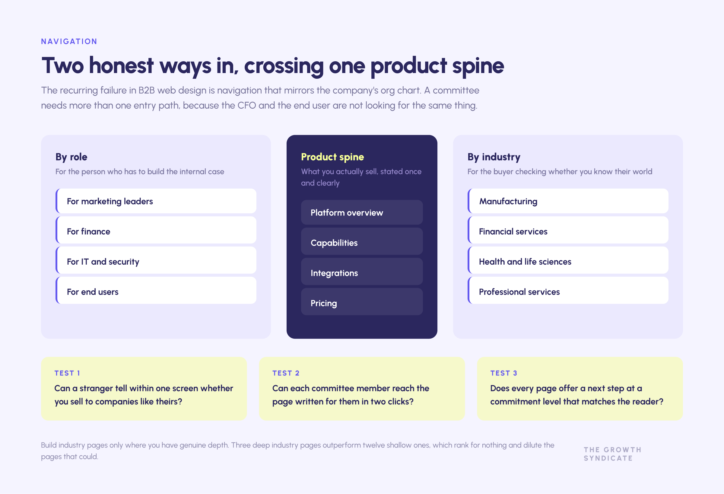
Intuitive navigation in B2B means giving the committee more than one honest path in. Most sites need two organising axes, usually by role and by industry, sitting alongside a clear product structure. Mega menus help when the inventory is genuinely large and hurt when they are used to avoid making choices.
Three tests that surface most problems without a research budget:
- Can a visitor who has never heard of you tell within one screen whether you sell to companies like theirs?
- Can each member of the buying committee reach the page written for them in two clicks?
- Does every page state what to do next, at a commitment level appropriate to where the reader is?
That last one matters more than it sounds. Calls to action should vary in commitment. A visitor reading a category explainer is not ready for "book a demo", and offering only that CTA converts them at zero rather than at something. A website with a single high-commitment CTA is not conversion focused, it is conversion narrow: it collects the potential customers who were already going to raise their hand and lets everyone else leave without a trace.
Clear messaging is what makes any of this work. Intuitive navigation cannot rescue a page whose headline could describe four competitors. Get the words right, then let the structure carry them.
Design and development: choices that outlive the launch
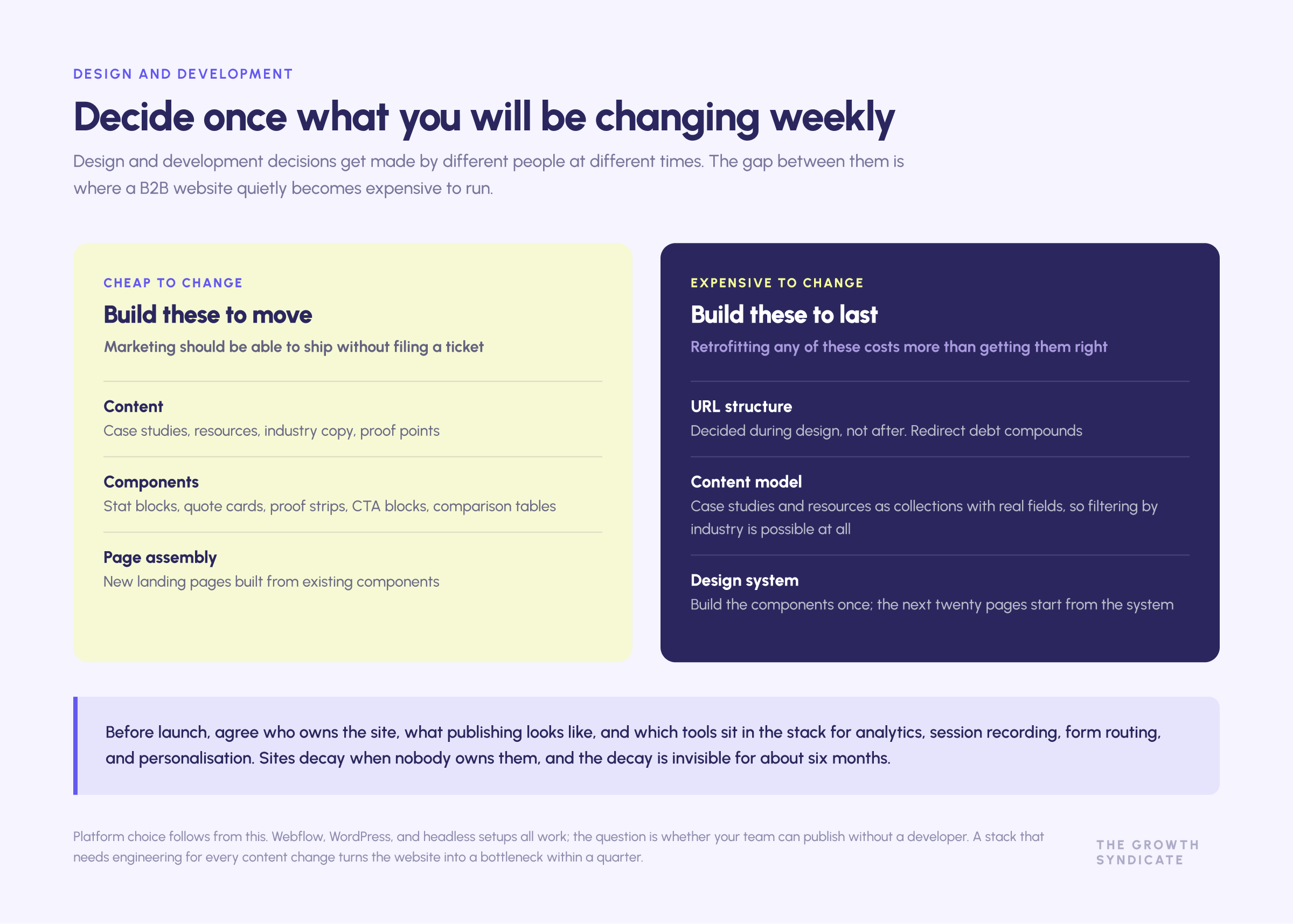
Design decisions and development decisions get made by different people at different times, and the gap between them is where B2B websites quietly become expensive to run.
The platform. Webflow, WordPress, and headless setups all work. The question is who edits the site after launch. If your marketing teams need to publish a case study without filing a ticket, choose the platform that makes that true and accept the trade-offs elsewhere. A custom development stack that requires a developer for every content change turns your site into a bottleneck within a quarter.
The design system. Ship reusable components rather than bespoke pages. A stat block, a quote card, a proof strip, a CTA block, and a comparison table cover most of what a B2B website needs, and building them once means the next twenty pages start from the system instead of from scratch. This is the single practice that most reliably keeps a site from degrading over two years.
The CMS structure. Model case studies, resources, and industry pages as collections with real fields, not as one-off pages. Filtering by industry and use case is only possible if the underlying content was structured for it.
The handoff. Agree who owns the site after launch, what the publishing process looks like, and which tools sit in the stack for analytics, session recording, form routing, and personalisation. Sites decay when nobody owns them, and the decay is invisible for about six months.
Best practices in web development change faster than best practices in messaging, so build the parts that are cheap to change (content, components) to be changed often, and the parts that are expensive to change (URL structure, content model, design system) to last.
Technical foundations: speed, mobile devices, and accessibility
Core Web Vitals
Interaction to Next Paint replaced First Input Delay as the third Core Web Vital in March 2024. The current thresholds are LCP at or under 2.5 seconds, INP at or under 200 milliseconds, and CLS at or under 0.1, measured at the 75th percentile of real users. HTTP Archive data from 2025 shows roughly half of mobile origins passing all three.
On the conversion side, the strongest study is the Deloitte and Google Milliseconds Make Millions analysis, covering 37 brands and more than 30 million sessions, which found a 0.1 second mobile speed improvement lifted retail conversions by 8.4%. B2B-specific conversion studies at that scale do not exist, so treat speed as an efficiency lever with strong indirect evidence rather than a guaranteed multiplier.
Mobile devices
Mobile matters differently in B2B than the generic advice suggests. Research and discovery happen on phones. High-consideration conversions still skew to desktop, because they happen during work hours on work machines and often involve sharing a link with a colleague.
Unbounce data shows the large majority of SaaS landing page visits arriving on mobile while desktop still converts slightly better. Design mobile-first for the reading and shortlisting behaviour, and expect the demo request itself to land elsewhere.
Accessibility
The European Accessibility Act became enforceable on 28 June 2025, extending accessibility obligations to private-sector digital products and services for any business serving EU consumers, regardless of where it is headquartered. The technical benchmark is EN 301 549, which currently incorporates WCAG 2.1 AA. Microenterprises have a limited exemption.
Pure B2B contracts may sit outside the strictest reading of scope, but procurement is pulling the same direction: Level Access's annual survey found three quarters of organisations require proof of accessibility at least most of the time when purchasing digital products. The same research reported that 28% of respondents at B2B organisations said their employer had been involved in accessibility-related legal action in the preceding 12 months. That figure comes from a self-reported survey run by an accessibility vendor, so read it as directional rather than as a base rate.
Search engine optimization is a design decision
Search engine optimization treated as a post-launch phase produces a new site that ranks worse than the existing site it replaced. The parts of SEO that are structural, meaning URL architecture, internal linking, heading hierarchy, page templates, and content depth per page, are decided during design and are expensive to retrofit.
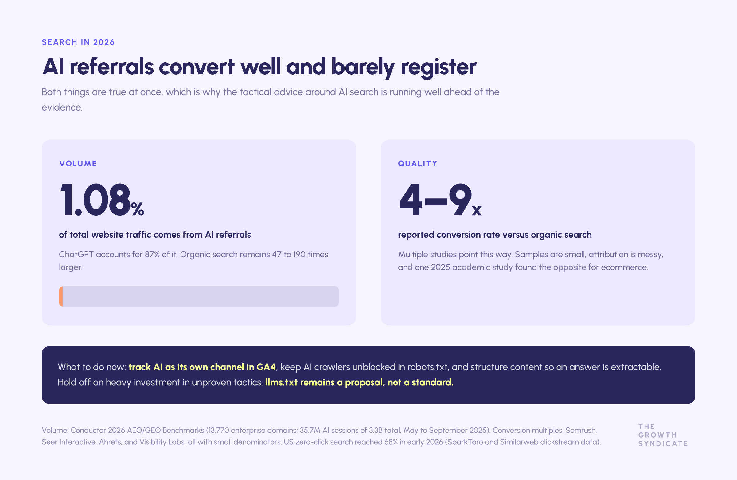
The larger 2026 question is AI search. Zero-click behaviour is rising: clickstream analysis from SparkToro and Similarweb put US zero-click search at 68% in early 2026, up from 60% in 2024. AI referral traffic is real but small. Conductor's 2026 benchmark across 13,770 enterprise domains measured AI referrals at 1.08% of total website traffic, with ChatGPT accounting for 87% of it.
The interesting part is quality. Several studies find AI-referred visitors converting at multiples of organic search, including Seer Interactive's analysis of a B2B software client and Ahrefs' own data. The samples are small and the attribution is messy, and at least one 2025 academic study found the opposite for ecommerce. The defensible position: track AI as its own channel, keep AI crawlers unblocked, structure content so an answer is extractable, and do not spend heavily on unproven tactics like llms.txt yet.
Our own view on this is set out in more depth in the SEO and AI-optimised search work we run for clients.
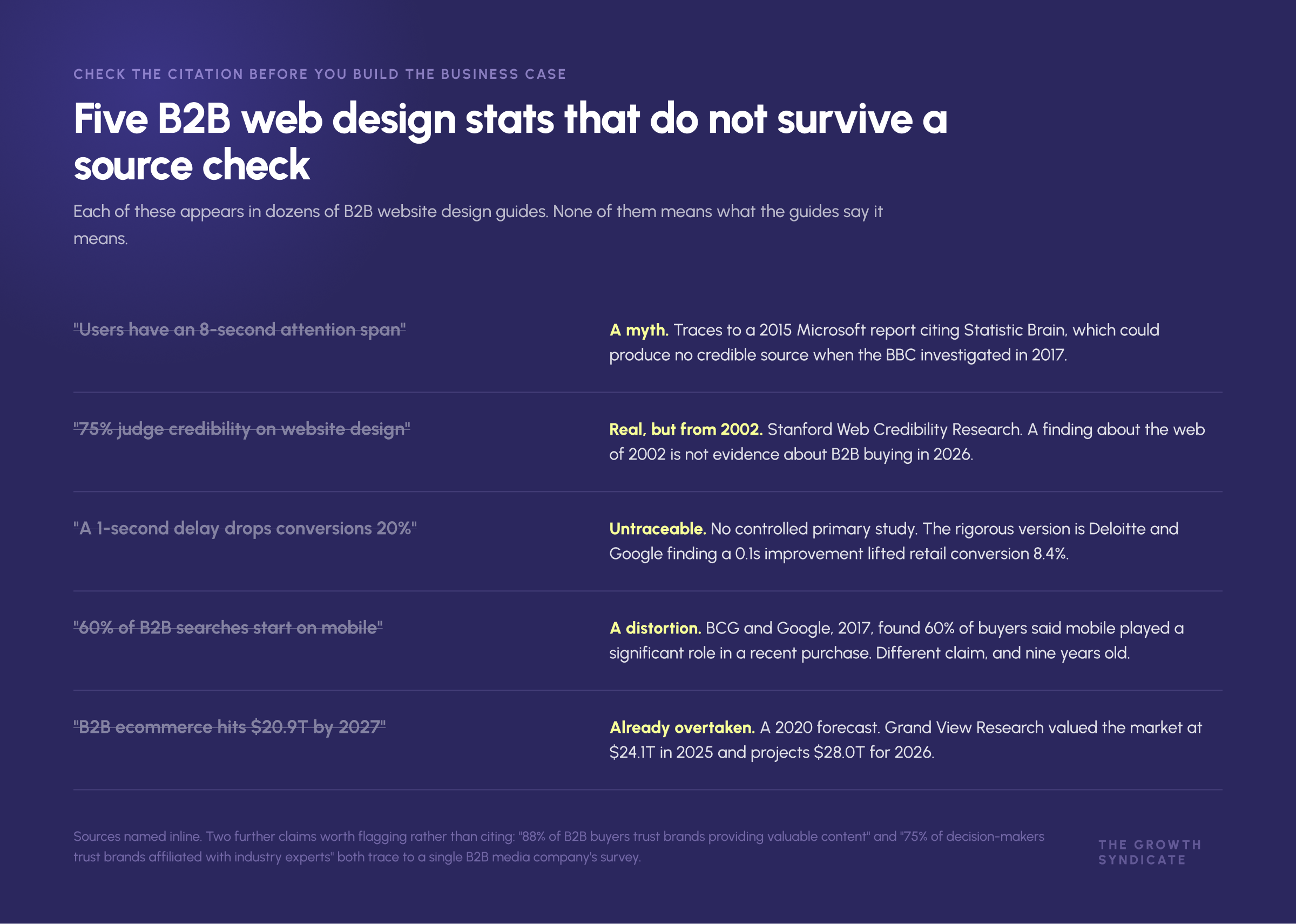
Five B2B web design stats that do not survive a source check
Web design content recycles the same numbers, and a surprising share of them collapse under a citation check. If you are building a business case for a new website, do not build it on these.
"Users have an eight-second attention span." A myth. It traces to a 2015 Microsoft report citing Statistic Brain, which could not produce a credible source when the BBC investigated in 2017. Gloria Mark's actual research at UC Irvine measures average attention on a single screen at around 47 seconds, which is a task-switching finding, not a shrinking span.
"75% of people judge a company's credibility on its website design." Real, but from Stanford's Web Credibility Research, published in 2002. Whatever you believe about design and trust, a finding about the web of 2002 is not evidence about B2B buying in 2026.
"A one-second delay drops conversions by 20%." Untraceable to a controlled primary study. The rigorous version is Deloitte and Google's 0.1 second finding cited above, which is a smaller and better-evidenced claim.
"60% of B2B searches start on mobile." A distortion. The underlying BCG and Google research from 2017 found that 60% of B2B buyers reported mobile played a significant role in a recent purchase, which is a different claim, and it is now nine years old.
"B2B ecommerce will reach $20.9 trillion by 2027." A forecast published in 2020 and long since overtaken. Grand View Research valued the market at $24.1 trillion in 2025 and projects $28.0 trillion for 2026. Citing the old number in 2026 signals that nobody checked.
Two more worth flagging rather than trusting: the widely repeated "88% of B2B buyers trust brands that provide valuable content" and "75% of decision-makers trust brands affiliated with industry experts" both trace back to a single B2B media company's survey. The direction is plausible. The precision is not earned.
Generic web design advice promises a seamless experience without ever saying what the experience is for. Specific evidence is harder to find and considerably more useful.
The B2B web design practices that do survive
Stripping out the folklore leaves a shorter list, and every item on it is supported by something you can check:
- Message match. The page continues the sentence the ad or the search query started.
- One job per page. Fewer competing options produce more completions.
- Published pricing, or a defensible anchor. The most consistent request in B2B buyer research.
- Third-party proof at the decision point. Review-site ratings and named, quantified customer outcomes next to the CTA.
- Fast, human response. Minutes, not days.
- Core Web Vitals inside threshold. Cheap to fix, compounding across every channel.
- Accessibility to WCAG 2.1 AA. Now a procurement requirement as much as an ethical one.
Those are the B2B web design practices worth defending in a planning meeting. Everything else is a hypothesis about your specific customers, and should be treated as one.
Why most B2B A/B tests cannot tell you anything
This is the methodological problem underneath every conversion tip you will read, including the ones in this article.
With a 3 to 5% baseline conversion rate, detecting a realistic 10% relative improvement at conventional statistical power requires tens of thousands of visitors per variant. Worked examples land in the range of 21,000 to 42,000 per arm. Wynter's practical threshold is that a page needs roughly 600 conversions a month before A/B testing is viable, which puts most B2B pages out of scope entirely.
Three things follow. Underpowered tests get stopped early on noise, which manufactures false wins. Non-significant results get misread as proof of no effect. And published "we lifted conversions by 340%" case studies are unreliable, because they combine small samples, no controls, regression to the mean, and the fact that nobody publishes the losers.
What works instead at B2B volumes:
- Test messages, not buttons. Qualitative message testing with 15 to 30 people from the target audience returns usable signal in days, because qualitative methods do not need large samples.
- Test at the offer level. Changing what you offer moves numbers far more than changing how you ask.
- Use painted-door tests to measure demand for something before you build it.
- Lean on session recordings, heatmaps, and moderated user testing to generate hypotheses. In a low-traffic environment these carry more weight than they would in consumer ecommerce.
How to measure a B2B website
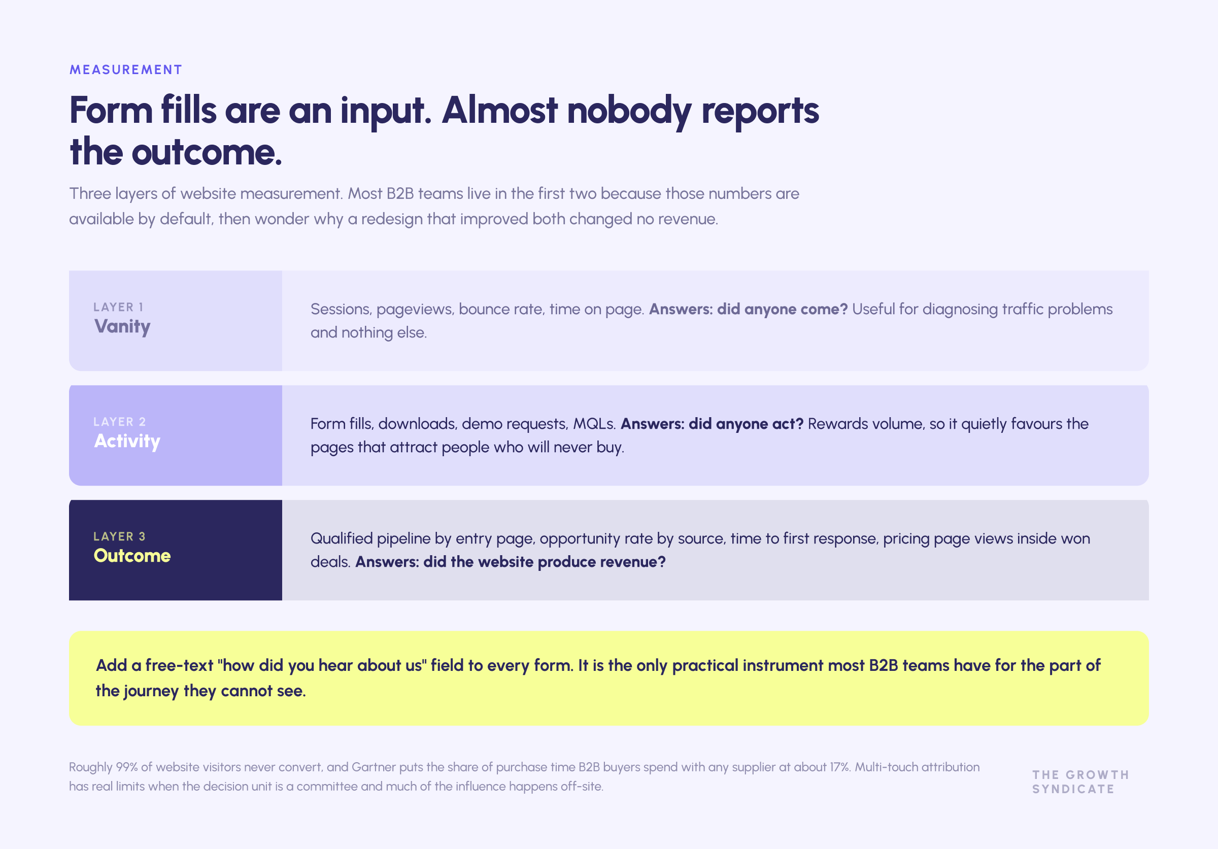
Form fills are an input, not an outcome. The measures that matter are qualified pipeline, opportunity creation, and revenue influence, plus lead quality by source.
Because roughly 99% of visitors never convert and most of the buyer's journey is invisible, add self-reported attribution to your forms. Asking "how did you hear about us" in a free-text field routinely produces a different picture from last-touch attribution, and it is the only practical instrument most B2B marketing teams have for the dark funnel. Multi-touch models have real limits when the decision unit is 13 people and half the influence happens on LinkedIn, in Slack groups, and in AI conversations you cannot see.
Our work with Frends turned on exactly this shift, from counting leads to tracking MQL-to-SQL conversion and sourced pipeline. A workable measurement set for a B2B website: qualified pipeline by entry page, opportunity rate by traffic source, time to first response, pricing page views inside won deals, and self-reported source on every form. Not all traffic to a B2B website is created equal, and a measurement stack that cannot tell the difference will keep recommending you buy more of the wrong kind.
The distinction that matters most is between pages that generate leads and pages that generate revenue. A gated ebook page can be the most lead generating asset on the site and contribute nothing downstream, while a pricing page that converts almost nobody appears in most won deals. Measuring web design on volume alone rewards the first and starves the second.
This is where website strategy meets digital marketing strategy. If you know which entry pages precede closed revenue, you know where to focus design effort, where to invest content resources, and which pages are simply converting visitors who were never going to buy.
Industry variations
B2B SaaS. Self-serve paths, transparent tiers, and a product tour do most of the work. The design risk is treating an enterprise motion like a self-serve one and hiding the sales path from buyers who need it.
Manufacturing industry. Technical specification depth, CAD and datasheet downloads, and distributor or configurator logic matter more than brand storytelling. Their customers are frequently engineers who want the spec rather than the narrative. Two of our own clients in this space, Madeinadd and Cutr, both saw gains that came from making relevant products and capabilities findable to their customers rather than from a visual refresh. The Madeinadd rebuild described earlier is the clearest version of this: the previous site demonstrated the technology beautifully and left buyers unable to work out which services applied to them.
Professional services. Proof and people carry the site. Named case studies, sector expertise, and visible senior practitioners outperform capability lists, because the customer is choosing a team rather than a product.
Life sciences and health tech. Regulatory posture, validation, and certification are load-bearing. Compliance information gates the conversation before commercial content gets read at all.
Financial services and fintech. Security architecture, certifications, and audit evidence sit alongside commercial terms. Expect procurement and risk to be reading the site before your champion has finished building the case.
The common thread across various industries is that the pages carrying the decision differ, even when the site structure looks similar. A life sciences buyer and a manufacturing buyer may land on visually identical solution pages and need entirely different things from them. Design the depth where your specific committee actually looks, and let your existing customers tell you where that is. The fastest research available to most B2B companies is asking ten current customers which page they remember from the evaluation and which question the site failed to answer.
This is also where a website strategy stops being a design exercise. Deciding which industries you serve well enough to build pages for is a positioning decision, and building pages for industries where you have one logo and no expertise produces thin content that converts nobody and dilutes the pages that could.
B2B website design examples worth studying
Rather than a gallery of attractive sites, the useful B2B website design examples are ones where you can identify the decision being made. Each example below solves a specific solution-communication problem, and the reason it belongs on the list is the mechanism rather than the styling.
- Stripe. Documentation treated as a primary marketing surface. The developer evaluating the product never has to ask for access to understand it.
- Linear. Positioning carried by craft and restraint. It is instantly identifiable, which is exactly what serves the out-of-market majority.
- Vanta. Trust content as the product story. Compliance evidence is the offer, and the site is built that way.
- Gong. A short, direct path from demo intent to a booked meeting, rather than a form followed by a wait.
- HubSpot. Published pricing across a wide product surface, plus role and industry entry paths for a committee.
- Figma. Product surfaces that let end users understand the tool before anyone talks to sales.
Study the mechanism rather than the aesthetic. Copying the visual style of a company with a different motion and a different buyer produces a site that looks current and sells nothing.
How much does it cost to design a B2B website?
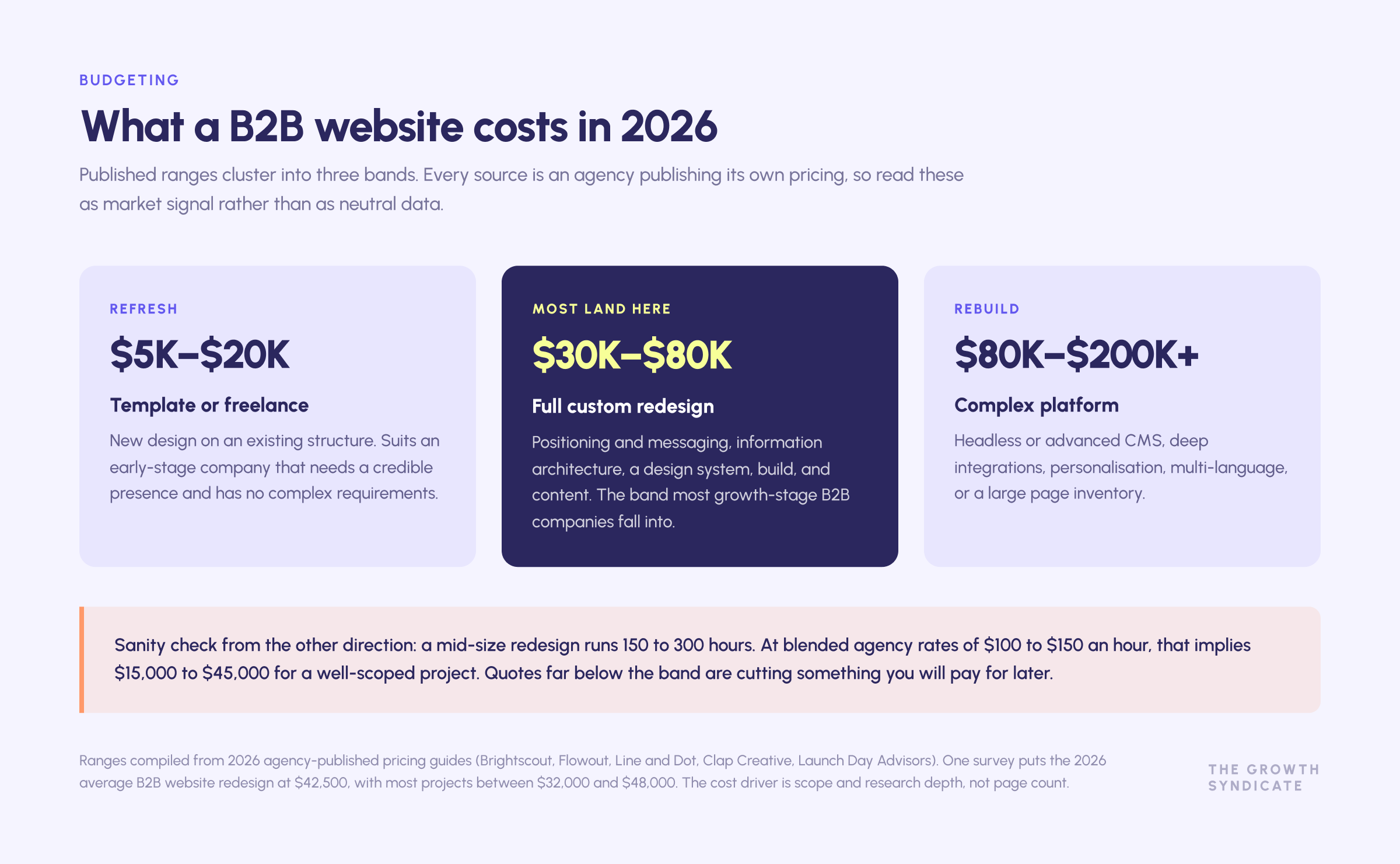
Published 2026 ranges cluster into three bands, and every source is an agency publishing its own pricing, so treat them as market signal rather than as neutral data.
- Template or freelance refresh: roughly $5,000 to $20,000. Suits an early-stage company that needs a credible presence and has no complex requirements.
- Full custom redesign with strategy: roughly $30,000 to $80,000. This is where most growth-stage B2B companies land. It covers positioning and messaging, information architecture, a design system, build, and content.
- Complex rebuild: $80,000 to $200,000 and up. Headless or advanced CMS, deep integrations, personalisation, multi-language, or a large page inventory.
Reported averages sit in the middle of that. One agency survey puts the 2026 average B2B website redesign at $42,500, with most projects between $32,000 and $48,000. A useful sanity check from the other direction: a mid-size redesign runs 150 to 300 hours, and at blended agency rates of $100 to $150 an hour that implies $15,000 to $45,000 for a well-scoped project. Quotes far below that band are cutting something you will pay for later.
The cost driver is scope and research depth, not page count. A 20-page site that requires new positioning, committee research, and a design system costs more than a 60-page site that reskins an existing structure.
Two things to check before signing. First, ask what services offered in the quote are strategy versus production, because a company paying agency rates for production it could have specified itself is the most common overspend. Second, ask who does the development and who does the writing. Design, development, and copy are three different skills, and a proposal that is vague about all three is usually vague on purpose.
Seven B2B website design mistakes that keep recurring
These show up in almost every audit, across company sizes and services.
- Designing for the founder's taste rather than the users. The people who approve the design are rarely the people who have to use it to make a case internally.
- A services page that lists capabilities instead of problems. Buyers search for their situation. Listing what you do without naming who it is for makes the reader do the translation, and most will not.
- Hiding pricing to "start a conversation". It starts fewer conversations, not more, and the ones it starts are worse qualified.
- Treating lead generation as the only job. This starves the 95% and produces a website that peaks in month three and decays after.
- Building industry pages you cannot support. Thin pages create the appearance of expertise and convert nobody. Better to have three deep industry pages than twelve shallow ones.
- No owner after launch. Content goes stale, case studies stop appearing, and the resources library dies quietly.
- Measuring only what is easy. Form fills, sessions, and bounce rate are available by default, which is why so many teams focus on them instead of on pipeline.
Most of these are strategy failures that surface as design complaints. Rebuilding the interface does not fix any of them.
A practical sequence for a new website
If you are commissioning a new site, this order prevents the most expensive mistakes.
- Fix the message before the design. Run message testing with 15 to 30 real buyers and existing customers, or a structured positioning and messaging process. Everything downstream inherits this decision.
- Map the committee. List every role that touches the purchase and the question each brings. That list becomes your page inventory.
- Decide the pricing posture. Publish, anchor, or gate, and be able to defend the choice with something other than habit.
- Design the two jobs explicitly. Name which pages serve the in-market minority and which build memory for everyone else. Do not let one starve the other.
- Build proof and trust content in parallel. Case studies, review presence, and a security page are content projects with long lead times, not launch-week tasks.
- Wire routing before launch. Qualification, routing, and instant booking. This is where the largest measurable gain sits.
- Protect the SEO you have. Redirect mapping, template-level structure, and internal linking, decided during design rather than after.
- Instrument for pipeline. Self-reported attribution, entry-page pipeline reporting, and response-time tracking from day one.
Most companies do steps four through eight after launch, which is why so many redesigns produce a better-looking site and a flat pipeline.
The short version
If you take one thing from this into your next planning meeting, take the two-audience problem. Almost every failure described above traces back to a website scoped for the 5% and judged on the 5%.
The companies that win shortlists are the ones whose solution is already familiar when the buying window opens. That familiarity is built by a website that stays memorable to non-buyers, and it is spent by a website that converts cleanly when they finally arrive. Design for both, and measure the second without starving the first.
The rest is execution: publish what your customers ask for, prove it with named clients and real numbers, make the services you offer legible to every role on the committee, respond in minutes, and keep the site fast and accessible. Those practices are unglamorous, they are supported by evidence, and most B2B websites do not do them.
If you want a worked example of the diagnosis before the design, that is what our Marketing and GTM audit exists to create, and B2B web design is where we act on it.
FAQ
What are the top 10 B2B websites in the USA?
There is no authoritative ranking, and any list claiming one is editorial opinion. If the question means most-visited business platforms, the answer skews to marketplaces and software platforms such as Amazon Business, Alibaba's US operations, Salesforce, HubSpot, and Microsoft. If it means best-designed B2B websites, the list is different and includes companies like Stripe, Figma, Linear, Vanta, and Gong. The two questions have almost nothing in common, so decide which one you are asking before you take a list seriously.
Is Canva a B2B brand?
Canva is both, and it is a useful example of why the label is doing less work than people assume. It grew through consumer and prosumer adoption, then built Canva for Teams and an enterprise tier that sells to other businesses with the account management, security, and admin controls that implies. The design lesson is that the motion determines the website, not the label. A product that lands with an individual user and expands into an organisation needs self-serve paths and enterprise proof on the same site, which is harder than doing either one alone.
How long does a B2B website redesign take?
Most projects run 8 to 16 weeks from kickoff to launch, with complex rebuilds reaching 20 weeks or more. The variable that stretches timelines most is content, particularly case studies and technical pages that need input from people who do not work in marketing. Companies that begin content production during the design phase rather than after it typically ship on time.
Should B2B websites gate their content?
Gate selectively. Gate genuinely unique, high-effort assets such as original research or a benchmark dataset, where the exchange is fair. Ungate awareness content, because gating it means the out-of-market majority never reads it and never remembers you. Our guide to B2B content marketing covers where the line sits. Gated ebooks create leads and rarely create customers. The practical test is whether the asset is worth an email address to the reader, not whether it is worth one to you.
How many pages does a B2B website need?
Fewer than most companies build, and deeper. A B2B website serving a mid-market technology company usually needs a homepage, two to five solution or product pages, an industry set matching where you genuinely have expertise, a pricing page, a case study library, a security or trust page, an about page with real people, and a resource library. Adding thin industry pages to chase search engine visibility produces pages that rank for nothing and dilute the ones that could.
What is the difference between B2B web design and B2C web design?
The decision unit and the timeline. B2C design optimises an individual making a fast decision, so the work concentrates on removing friction from a single path. B2B web design serves a group making a slow, risky decision over months, which means the site has to supply evidence to people who never speak to you, stay consistent with what sales says, and remain memorable across sales cycles measured in quarters. Conversion technique transfers. The assumption that one visitor equals one decision does not.
Do you need a professional agency, or can an in-house team handle a B2B website?
It depends on which part is hard for you. If your positioning is settled and your team has design and development capability, an in-house build gives you speed and ownership. If the difficulty is knowing what the site should say, a professional partner earns its fee in the strategy phase rather than in the pixels. The common failure is hiring a B2B web design agency to solve a positioning problem, then blaming the design when the new website performs like the old one.
What tools should sit behind a B2B website?
A minimum useful stack: analytics with conversion tracking, a session recording or heatmap tool for qualitative signal, a form and routing layer that qualifies and books meetings automatically, and a CRM that receives clean source data. Personalisation and reverse-IP tools are worth adding once the basics are working, especially those running account-based programmes where the page needs to match the account. Adding tools before the measurement question is answered produces dashboards nobody trusts.
How do you know if your website is the problem?
Look at where the drop happens before you rebuild. If the right traffic arrives and leaves without reaching a conversion point, the problem is messaging or navigation. If the wrong traffic arrives, the problem is upstream in search engine and channel strategy. If leads arrive and pipeline does not, the problem is qualification and routing rather than design. Redesigning the site when the failure is downstream is the most common and most expensive misdiagnosis in B2B digital marketing.
Related work
Services
- B2B web design
- Positioning and messaging
- Marketing and GTM audit
- SEO and AI-optimised search
- Account-based marketing
- RevOps and CRM
- Strategic Performance
- Frends case study
- Cutr case study
- Madeinadd case study
Further reading
.png)